Friday
Sep162016
FYI
All of my blogging activity is on my new blog site, lifesquared.squarespace.com.
![]()


BODIES OF WORK ~ PICTURE GALLERIES
BODIES OF WORK ~ BOOK LINKS
In Situ ~ la, la, how the life goes on • Life without the APA • Doors • Kitchen Sink • Rain • 2014 • Year in Review • Place To Sit • ART ~ conveys / transports / reflects • Decay & Disgust • Single Women • Picture Windows • Tangles ~ fields of visual energy (10 picture preview) • The Light + BW mini-gallery • Kitchen Life (gallery) • The Forks ~ there's no place like home (gallery)
All of my blogging activity is on my new blog site, lifesquared.squarespace.com.
;)
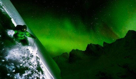
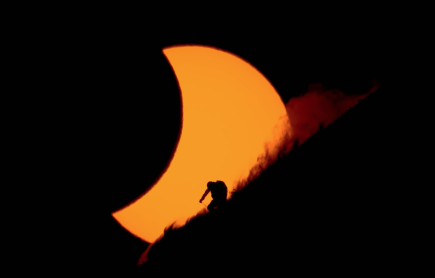
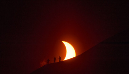
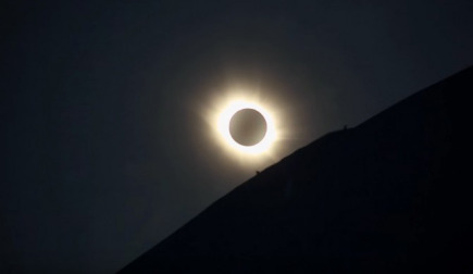
Notable amongst the selected films was the film ECLIPSE which chronicled the quest by photographer Reuben Krabbe to make a rather mission-impossible, once-in-a-lifetime possibility picture - that of a skier silhouetted against a solar eclipse. The film and the resulting picture - yes, he nailed it - is visually stunning and the story is rather compelling.
You can view the entire film in full-screen HD - ECLIPSE - highly recommended (the film is about 30 minutes long).
And, the BMFFWT might be coming to a location near you. You can check the schedule / locations here - Banff Mountain Film Festival World Tour locations Work product • no embiggenOnce again, some might wonder where I've been. At least one of you, Jimmi Nuffin, was driven to write:
I know you have a life and things to do…BUT…could you PLEASE post something for those of us who don't?
Now I am certain that most if not all of you weren't that desperate. Nevertheless, I do apologize for being remiss in my posting endeavors ... BUT ... as Mr. Nuffin acknowledged, I do have a life and, at times, it does get in the way of getting done everything one might wish to get done.
In my particular case, one thing I had to get done - gotta raise money for more picture making gear, after all - was the project pictured in this entry. It's a direct mail marketing piece and (not pictured) the start of a related ad campaign. As you might guess from looking at the pictured piece, identifying and making arrangements for 9 different (and relatively far flung) locations, coordinating my schedule with those of 9 very busy subjects and then finally making the pictures is a time consuming activity.
And that's just the picture making part of the project. The design and production time is not measured in hours, it's measured (incrementally and cumulatively) in days.
In any event, it's mostly over but for the shouting. Consequently, I have a couple entries ready to go and, hopefully, Mr. Nuffin will have something to do with his life.
FYI, the pictured project from top to bottom:
1. back and front cover - lightweight card stock, front cover with embossed and foil stamped logo
2. inside spread (front)- 4 panel, tri-fold (accordion fold)
3. inside spread (back) - blank panel affixed to inside of back cover
;)
;)
;)
;) Spreads - Adirondack Life / Dec 2012 • click to embiggenAs previously mentioned, some of my The Forks ~ there's no place like home pictures were going to be published in a feature article in Adirondack Life magazine. I now have in hand the December 2012 issue of Adirondack Life which includes that article.
Spreads - Adirondack Life / Dec 2012 • click to embiggenAs previously mentioned, some of my The Forks ~ there's no place like home pictures were going to be published in a feature article in Adirondack Life magazine. I now have in hand the December 2012 issue of Adirondack Life which includes that article.
The layout/design of the article is quite visually pleasing. It looks more like that found in a photo book / magazine than it does like that most often seen in a general interest magazine layout - lots of white space and very nice typography. And, as an added bonus, one spread in the article is the center spread of the magazine.
The pictures in the article are prefaced by the Artist Statement from my gallery exhibition / body of work, The Forks ~ there's no place like home, and thereafter by quotes from a few Au Sable Forks residents. IMO, those quotes add a very personal / human overlay to the pictures. Each picture is also identified by its title.
a humorous and instructive (how people look at pictures wise) aside: I was showing the article to a neighbor - who also happens to be a town supervisor - and as he was viewing the Clouds / Stewarts picture on the first spread, he gave a little laugh and said "Until I read the title, I didn't even see the clouds ... I was looking to see who it was who was pumping gas."
 gravitas et nugalis
Featured Comment: John Linn wrote: "Looks like they did a nice job. Did you participate in the layouts or art direction?"
my response: NO, I did not participate in any manner with layout / art direction. Although ... they do have a copy of my book, The Forks ~ there's no place like home, which has my "standard" wide white border layout/design. Don't know if that influenced them in any way ....
;)
;)
;)
;)
;)
;)
;)
;)
;)
;)
I've spent the past few days putting together a POD book which is being sent (by request) to a couple curators / gallery directors. The book (81 pages) is titled, Bodies of Work ~ a sampler, and has 9 sections, each section comprised of a title page followed by 6 pictures examples from each body of work. The section title pages have a grouping of the 6 pictures which follow in that section - the purpose of the grouping is to illustrate how the pictures work together, visually, as a body of work.
The page sample pictures posted in this entry are (top - bottom): cover, title spread, section title page + the 6 pictures in that section, the remainder of the title pages. Even though, at the very top of the entry, there is a Shutterfly share book version in which you can view the entire book, I have included the sample page pictures so you can have a higher quality look at some of the pages.
While I stand by my many previously written endorsements, re: Shutterfly's excellent quality POD books, their shared book e-versions are seriously lacking in the visual quality department. They are better than nothing but only by a slim margin. The shared book allows a viewer to have a sense of a book's layout and flow but details (image and typography sharpness) are not good. However, keep in mind that shared books are free.
That written, if Shutterfly were to offer a true high quality e-book conversion service, I would be more than happy to pay a premium for that service.
;) Spread ~ Adirondack Life Magazine • click to embiggenI was just informed that an article (in Adirondack Life magazine), which featured some of my post Hurricane Irene pictures, received a gold award in the General Feature category from the International Regional Magazine Association. While the award was not specifically for my pictures, it's always nice to be part of the success which comes with the mining of gold.
Spread ~ Adirondack Life Magazine • click to embiggenI was just informed that an article (in Adirondack Life magazine), which featured some of my post Hurricane Irene pictures, received a gold award in the General Feature category from the International Regional Magazine Association. While the award was not specifically for my pictures, it's always nice to be part of the success which comes with the mining of gold.
;) The ticket ~ Syracuse, NY • click to embiggen
The ticket ~ Syracuse, NY • click to embiggen;) Rev. Hobson punching their tickets ~ Syracuse, NY • click to embiggenReverend Hobson's first wedding ceremony went off without a hitch. Well, except for the fact that everyone, to include the best man / maid of honor / Reverend Hobson and most notably the wedding couple, forgot all about the wedding rings until after I had pronounced them husband and wife (by the power vested in me). But at least they got their rickets punched.
Rev. Hobson punching their tickets ~ Syracuse, NY • click to embiggenReverend Hobson's first wedding ceremony went off without a hitch. Well, except for the fact that everyone, to include the best man / maid of honor / Reverend Hobson and most notably the wedding couple, forgot all about the wedding rings until after I had pronounced them husband and wife (by the power vested in me). But at least they got their rickets punched.
In any event, I kept it short and sweet (the temperature inside the railroad car was over 100˚F) and everyone had a great time.
FYI, here is the script / text from my service (written by me - with an assist from the wife - and dictated to the wife during our morning car ride to the NYS Fair on the day of the event):
Welcome all of you to Luke and Linda's wedding. It means a lot to them that you are all aboard to see them off as they begin their journey. And, I'd like to thank Luke and Linda, for affording me the opportunity to be the conductor for this wedding ceremony...
When I first was informed that Luke and Linda were going to be married on railroad car at the NYS Fair, I thought it to be a bit weird. However, after thinking about it and now actually being here, I think it's really weird.
Nevertheless, I guess it is rather appropriate to begin one of life's most important journeys on this antique railroad car. After all, the naked truth is, if Linda didn't have a fondness for old things (indicate my brother), we wouldn't be here today.
In any event, like all train trips, there might be whistle stops at strange locations, derailments, or even train wrecks along the way. But I would remind Luke and Linda that the journey, with all its rewards and hazards, is at least as important as the destination. Therefore, enjoy this trip, that begins in new York state and arrives at the state of connubial bliss.
In that spirit, I now present Luke and Linda with their one way tickets, to their ultimate! destination.
Now, as You have all journeyed here to share the day as Luke and Linda become husband and wife, I invite you to witness their vows. Without actually knowing who's the engineer and who's riding the caboose on this train, I will begin with Luke.
Do you Luke, take Linda to be your lawfully wedded wife, to have and to hold, for rich or for poor, in sickness and in health, till death do you part?
Ticket please (punch the ticket)
Do you Linda, take Luke to be your lawfully wedded husband, to have and to hold, for Rich or for poor, in sickness and in health, till death do you part?
Ticket please (punch the ticket)
By the power vested in me, I now pronounce you husband and wife.
BTW, that last sentence is one that I never imagined ever uttering in my lifetime.
PS thanks to my son, The Cinemascapist, for designing the ticket on very short notice. While I had planned to do it, I nevertheless left home 2 weeks before the ceremony (taking Hugo to Rochester for hockey camp) without tickets in hand and never thinking that I wouldn't be back home before the ceremony. So, on the afternoon before the wedding date, I called Aaron from our cottage on Blue Mountain Lake and asked him to design the ticket. He send me a proof via email and I arranged for him to email the finished ticket to a Kinko printing center in Syracuse and was able to pick up the tickets the next morning on our way to the Fair. My thanks to Aaron the modern wonder of the internet and email.
gravitas et nugalis
Featured Comment(s): John Linn wrote: "Do you Linda, take Luke to be your lawfully wedded wife, to have and to hold, for Rich or for poor, in sickness and in health, till death do you part?" .... Can we assume a typo or is there more to the story?"
And Sven W (no link provided) wrote: "A railroad car certainly presents limited opportunities for the wedding photog!"
my response(s): John, I guess the wife isn't as good at taking dictation as I thought. And Sven, that's no wedding photog, that's my wife (who made the picture) - the guy in the orange shirt is a tv videographer).
;) Portrait on location • click to embiggen
Portrait on location • click to embiggen;) A Portrait setup • click to embiggenSuddenly, I am knee deep in client requests for portraits made on location.
A Portrait setup • click to embiggenSuddenly, I am knee deep in client requests for portraits made on location.
I can honestly say that I have never pursued portrait business, other than portraits made for business clients. In fact, other than family members, I have probably made less than a dozen non-business portraits. On the other hand, I have made hundreds of business client portraits - corporate CEOs for use in annual reports, general workers (business and labor) for annual reports and corporate capability publications, editorial / magazine feature and cover uses, to name just a few types of business portraits.
While some portraits were made in work environment available light, reportage style, many were made with setups similar to that shown here. In some of those situations, the lighting requirements were much more complex than the pictured setup. It was not uncommon to be using 4-5 lights and multiple scrims and fill cards and hauling all the stuff around was a pain in the ass. But, of course, it wasn't my ass hauling all that stuff around because that's what god made photo assistants for.
The lighting setup for yesterday's session - 3 different persons - was rather simple. The main light was a strobe with a large reflector with diffusion screen attached, and a fill card to soften the shadows. The background umbrella light was connected to another strobe power pack on which the wireless triggering sync was turned off. That was so because I wanted to bathe the background in the warm tungsten light of the modeling lamp.
I still use strobe equipment for 2 reasons - first) it's what I know and, second) at this time, I don't do enough of this kind of work to justify the expense of acquiring professional quality LED light panels.
FYI, I still keep my hand in this market because it is much more lucrative than the general (public) portrait market. In the business market, I don't have to compete with the Sears / department store portrait studios and other not-so-skilled-but-cheap purveyors of less than discriminating pictures. And, the income helps feed my art / personal habit.
