Tuesday
Oct312006
The way I see it...
 Tuesday, October 31, 2006 at 01:45PM
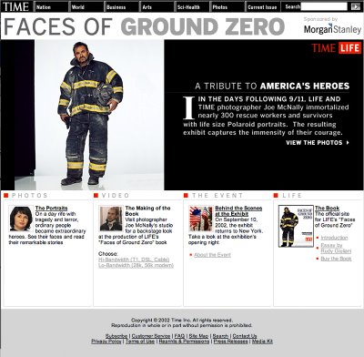
Faces of Ground Zero is the title of a photography book and traveling exhibit (by Joe McNally), both of which purport to be a "Tribute to America's Heroes", but I just don't/can't see it that way. To my eye and sensibility, it looks like little more than commercial crap and media flap.
There are seemingly ever-emerging bodies of recent disaster/tragedy photography (by individual photographers) which seem to exist soley as excercises of "artistic" expression. In addition to Faces of Ground Zero, the Katrina photographs of Dan Burkholder also fall into this emerging "genre" as well.
I don't get it.
How does photographing first-responders, survivors, and victims families with a commercially-slick Cosmopolitan-Covergirl/Bloomingdale-Fashion-Catalog technique create a "tribute"? A tribute to what - the photographic capability to turn everything into commercialized/commodified icons of a consumer culture?
How does manipulating photographs of a natural disaster and the resulting personal tragedies into cartoon illustrations serve any purpose other than artistic technique for artistic technique's sake?
Help me here - what am I missing?
If it is suppose to be the notion of "horrific" beauty, I think that both of these photographers might better spend some time with the disaster/tragedy photographs of Joel Meyerowitz (Aftermath) and Katherine Wolkoff (After The Storm). Both of these photographers have taken a more honest, more respectful, and, much more self-effacing photographic approaches to the disconcerting idea of horrific beauty.
FEATURED COMMENT: Paul Ralpaelson wrote: "When it comes to selling bars, trucks or even politicians, you can wave the flag or you can drape one over a coffin. You can’t do both." His link to a related read.
FEATURED COMMENT #2: Michelle Parent wrote: "I don't get why he had them all in that sterile white space! It isolates them from the tragedy in more than a visual sense. You can't connect these people in these photos with the words next to them. It is as if he took a bunch of actors and put them in costume and makeup, stuck them under lights, etc. They don't seem "real". I hate it!"


Reader Comments (4)
"When it comes to selling bars, trucks or even politicians, you can wave the flag or you can drape one over a coffin. You can’t do both."
http://www.nytimes.com/2006/10/30/business/media/30carr.html
It's unfortunate that all the fads of recent years have been so lame (especially this one), but hey, so was disco and 80's music.
If Joe McNally has "immortalized 300 rescue workers and survivors" with his photography, then can you say that title sponsor Morgan Stanley has been blessed to honor them with this title.
That Chevy commercial damn near ruined the World Series for me and these sterile images of Joe McNally give me the shakes.