counter customizable free hit
About This Website

This blog is intended to showcase my pictures or those of other photographers who have moved beyond the pretty picture and for whom photography is more than entertainment - photography that aims at being true, not at being beautiful because what is true is most often beautiful..

>>>> Comments, commentary and lively discussions, re: my writings or any topic germane to the medium and its apparatus, are vigorously encouraged.

Search this site
Recent Topics
Journal Categories
Archives by Month
Subscribe
listed

Photography Directory by PhotoLinks

Powered by Squarespace
Login
« civilized ku # 3096-97 + an oldie ~ color and composition | Main | civilized ku # 3089 ~ touchdown Jesus »
Tuesday
May102016

civilized ku # 3090-95 ~ immitation / flattery
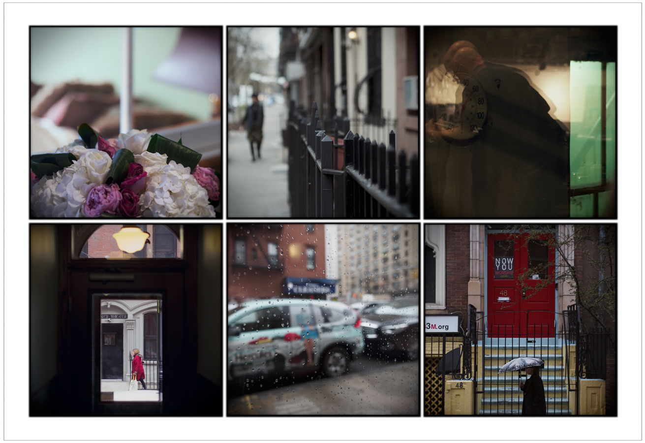
looking like Leiter ~MAnhattan / NYC click to embiggen

During my recent 2 visits to NYC - after acquiring a Saul Leiter book during my first visit - I turned my eye and sensibilities (and camera) to making Leiter-style pictures. Pictures in which the referents and the look paid a certain amount of homage to Leiter's picture making sensibilities. For the record, I was not attempting to emulate precisely Leiter's work but to make pictures - with my unique vision - which would not be mistaken for Leiter's pictures but rather with a resemblance thereto.

But here's the interesting thing - I based my idea on the look of Leiter's work from the reproduction of his work in his Early Color book. After acquiring the 2nd Leiter book (during my 2nd recent visit), Colors, I was rather surprised to discover a significant difference in color and tonal values, re: pictures printed in both books, from one book to the other.

So, the question arose, which reproduction constituted the most accurate representation of the original pictures? Not having had the experience of viewing any of his original prints, I have no frame of reference to make a judgement regarding which book is most accurate.

If I had to make an educated guess, my money's on the Colors book. The color and tonal values in that book are much 'cleaner'. More along the lines of what I would expect from pictures from the era in which they were made. In addition to the cleaner look, there is decidedly more detail in the deep shadow areas of the pictures which leads me to believe that the first book got it wrong.

All of that written, I nevertheless believe that many of my Leiter-like pictures are a reasonable homage to man and his work.

Reader Comments

There are no comments for this journal entry. To create a new comment, use the form below.

PostPost a New Comment

Enter your information below to add a new comment.

My response is on my own website »
Author Email (optional):
Author URL (optional):
Post:
 
Some HTML allowed: <a href="" title=""> <abbr title=""> <acronym title=""> <b> <blockquote cite=""> <code> <em> <i> <strike> <strong>