civilized ku # 2393 / diptych # 15 / triptych # 7 ~ "handling" color
 Wednesday, November 7, 2012 at 04:58PM
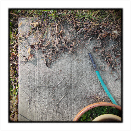
  Garden hose ~ Au Sable Forks, NY - in the Adirondack Park • click to embiggen
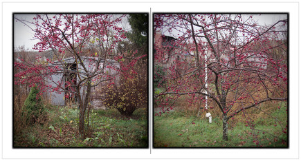
 Cherry trees ~ Au Sable Forks, NY - in the Adirondack Park • click to embiggen
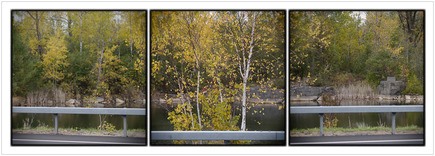
 Small quarry ~ Peru, NY • click to embiggenOn the entry ku # 1219 ~ entre chien et loup, Sven (no link provided) wrote:
I really like the way you and another photographer / blogger (Ming Thein) handle colour ... my efforts are ham-fisted compared to you two guys ... Any advice on the topic would be appreciated!
my response: It would very time consuming, entry making wise, to give meaningful / comprehensive advice, re: color processing work, on this blog inasmuch as my color work on any given picture is usually quite involved / complex with many individual steps. An entry detailing such work would have to be very long and involve the making of a significant number of screen grabs, all of which, to be honest, is more work than I am inclined to do.
That written, I can try to give a broad / general outline of my color processing procedures ...
1) I always shoot RAW, so my first step is a RAW conversion - using a dedicated conversion only software - in which I make global color adjustments. The objective is to produce a file which is, over all, color corrected / adjusted to the original scene. On many occasions, I also convert a second ISO bracketed image file for use in capturing additional highlight or shadow detail.
During the conversion processing, I use WB correction, global exposure adjustment (very minor, if at all), curves (LAB and RGB, depending upon my objective), global hue & saturation correction, shadow adjustment (again, very minor, if at all), and highlight recovery (if needed).
2) After the converted file(s) are saved, I open it in Photoshop and go to work - at this point, I make localized color, hue and saturation, and tonal adjustments as I deem necessary to achieve a result which is as true to the original scene as is possible. I pay particular attention to over saturation in individual colors and color casts such as UV effects.
Some localized adjustments are made by copying and blending highlight or shadow detail, taken from my ISO bracketed file(s), into my master image file. The blending is achieved by placing the copied details on separate layer and blended using the Multiply or Screen blending options and the opacity slider in the Layers Palette.
In Photoshop, my primary adjustment tools are; curves in both RGB and LAB color space (each color space has its own specific capabilities), hue & saturation sliders (generally for specific individual colors), sponge tool, and the eraser tool (for very fine localized blending).
When checking for color casts or making color adjustments, I rely on my eyes (my monitor is well calibrated) together with the Info Palette - the Info Palette can tell me exactly where on an individual color curve to make an adjustment as well as determining, numerically, the results of a color adjustment.
The Info Palette is especially useful in obtaining very clean neutral colors (whites, grays, blacks). Good clean neutral colors in a picture are very important because all other colors will "pop" (without the need for over-saturation techiniques) when they play off neutrals.
One of things I am most pleased with, re: processing pictures, is the fact that most viewers of my pictures really think that I don't do any post picture making processing at all. Their first impression is that I have just used what the camera gave me because my pictures look so "natural".
IMO, that impression is a highly desirable end result. After all, as Robert Adams wrote In his book, Beauty in Photography:
Why do most great pictures look uncontrived? Why do photographers bother with the deception, especially since it so often requires the hardest work of all? The answer is, I think, that the deception is necessary if the goal of art is to be reached: only pictures that look as if they had been easily made can convincingly suggest that beauty is commonplace.
All of that written, I would be remiss if I didn't point out that, when making pictures, I have an eye for color. In a very real sense, my eye for color in the natural / human-made world is the most important asset I have for "handling" color. My eye is very aware of and sensitive to color harmony or color discord and I use both color qualities / characteristics in the making of my pictures. Again, in a very real sense, I have a "head start" with "handling" color even before I set to work in the processing arena.

Reader Comments (1)
Thanks Mark. I realise that providing details is a drudge, but an article like the one you did back on 18 Mark 2011 (St Patrick's Day) is a gem.
Thinking about the numerous edit steps required (and the underlying colour + tone smarts you need to orchestrate this), I can see why many photographers want to push the H&S slider towards "11".
It's a lot simpler to boost saturation instead of working towards...
"Good clean neutral colors in a picture are very important because all other colors will "pop" (without the need for over-saturation techniques) when they play off neutrals."
If didn't know any better (i.e I was a novice photographer) I would look at your images and think "yeah, he must be using a top camera and great glass to get those colours and [micro]contrast".