counter customizable free hit
About This Website

This blog is intended to showcase my pictures or those of other photographers who have moved beyond the pretty picture and for whom photography is more than entertainment - photography that aims at being true, not at being beautiful because what is true is most often beautiful..

>>>> Comments, commentary and lively discussions, re: my writings or any topic germane to the medium and its apparatus, are vigorously encouraged.

Search this site
Recent Topics
Journal Categories
Archives by Month
Subscribe
listed

Photography Directory by PhotoLinks

Powered by Squarespace
Login

BODIES OF WORK ~ PICTURE GALLERIES

  • my new GALLERIES WEBSITE
    ADK PLACES TO SIT / LIFE WITHOUT THE APA / RAIN / THE FORKS / EARLY WORK / TANGLES

BODIES OF WORK ~ BOOK LINKS

In Situ ~ la, la, how the life goes onLife without the APADoorsKitchen SinkRain2014 • Year in ReviewPlace To SitART ~ conveys / transports / reflectsDecay & DisgustSingle WomenPicture WindowsTangles ~ fields of visual energy (10 picture preview) • The Light + BW mini-galleryKitchen Life (gallery) • The Forks ~ there's no place like home (gallery)


Wednesday
Apr062016

civilized ku # 3072 ~ this is just a test

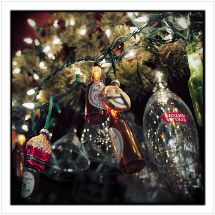
beer bottle lights ~ Wilmington, NY - in the Adirondack PARKclick to embiggen

While I wait for Squarespace to figure out why I can't use their resize function, I figured out a work around. Or so I think.

For some reason, when I click on link (using Safari) on my desktop computer, I get a Norton warning - "Malicious Web Site Blocked". Then, when I click on the "I want to view this Web site anyway", it takes directly to the linked image in the popup window. This does not happen when I use Safari on my laptop - clicking on the link goes directly to the popup window. This also does not happen when I use Firefox on my desktop computer.

In any event, I await input from any of you who can not see the popup window when you click on the click to embiggen link. Please let me know if you have a problem. If this work around works for everyone, I will continue to post using it.
Tuesday
Apr052016

civilized ku # 3071 ~ does it ring true?

place mat ~ Wilmington, NY - in the Adirondack PARK

I haven't posted since early last week, not because I had nothing to write but rather that I was preoccupied by matters color processing wise and I am experiencing a problem with uploading and resizing pictures here on Squarespace. Therefore, today's picture has no embiggen feature.

The problem on Squarespace started on Friday and has yet to be fixed although according to SS support, "[T]he whole image processing part of our platform is being actively looked at. We're hoping for a fix as soon as possible, and our engineers are currently working on it." They're hoping. I'm hoping. When a fix will be had, who knows.

That written, back to matters color processing wise - there have been a couple entries on TOP regarding color - Color Calibration and Color Photoshopping (on which I had a featured comment). And, on another TOP entry, mention was made of book, LIFELIKE: A Book on Color in Digital Photography in which the author attempts to address the "increasing lack of satisfaction with digital color" with techniques which, in a sense, replicate pre-digital film-like color and tonality.

I purchased the book (e-book for MAC platform only) out of curiosity and my return on investment was virtually nonexistent. While his thoughts on color are good and somewhat in line with my own, the author spends way to much digital ink on how past masters in the realm of painting handled color. While a reader might learn something about color theory and its application in painting, I fail to see its relevance to making pictures in the medium of photography.

In addition, his method for obtaining pre-digital color and tonality (film-like) depends on the use of a RAW converter - Raw Photo Processor (RPP) (free software, albeit for the MAC platform only) - which has a rather clunky non-intuitve interface and requires a pretty comprehensive re-think of the RAW conversion process.

I spent a fair amount of time using RPP on images I had previously processed using my standard RAW conversion software - Iridient Developer, a converter which is noted for its natural film-like output - and, quite frankly, it did not produce any results that I couldn't achieve using the ID software. But then again ...

... the results I achieve from ID software are obtained by using my 40+ years of technical color experience. Experience which is put to use in the cause of producing clean, well-balanced natural yet rich (non-garish, non-over saturated) color in my pictures.

None of the above should be understood or construed as a reason not to purchase the book or download RPP and give a try. I am certain that both could be of value to anyone who is interested in exploring color options that are much more life-like than that which is spit out by the 'canned' defaults in LR / CR and other such RAW converters.
Monday
Mar282016

single woman # 33 ~ things are getting strange

1044757-26940327-thumbnail.jpg
single woman ~ Wilmington, NY - in the Adirondack PARK • click to embiggen

You know things are out of whack in the good ol' US of A when:

1) an old Jew and a Cuban can't win an election in Florida,

and,

2) when a candidate for a party nomination for the presidential election states that he will make America great again.

iMo, he will only be able to do so by outlawing shredded cheese cuz everything else he is proposing is unabashedly ludicrous.
Friday
Mar252016

civilized ku # 3069-70 ~ what's wrong with 'muddy'?

1044757-26936856-thumbnail.jpg
drooping flowers ~ Au Sable Forks, NY - in the Adirondack PARK • click to embiggen
1044757-26936887-thumbnail.jpg
375 cold beers ~ Keeseville, NY - in the Adirondack PARK • click to embiggen

Back in the good ol' days of analog color picture making - film+messy chemicals+dust+drying cabinets+print dryers - picture makers were rather limited - without employing time-consuming and technically challenging printing techniques - in their print making, tonal range wise. There was no such thing as contrast-graded color papers. There were a variety of color papers available from different manufacturers (and color films) which had their own distinct visual characteristics but that was about it, choice wise, in exercising control, re: tonal range.

In today's much less messy color picture making world, the tonal range of a picture can be just about anything the picture maker wants it to be. However, the technical perfectionists have elevated their concern about the dynamic range of sensors to the level of a fetish. Not that there is anything wrong with wide dynamic range sensor, especially so in very high contrast picturing situations, but, iMo, that fetish has lead to the idea that, to be good, a color print must always have a maximized tonal range - think 5-250 (out of 0-255).

That idea is most likely a holdover from Sir Ansel's B&W Zone System in which a print must have tonal information in all 10 zones to be considered good. Less than that and a print is judged to be 'muddy' and who wants 'muddy' pictures?

The problem with that idea is that it tends to negate the the fact that, in the real world, not everyday or picturing situation is a full-range, tonal wise, sunny day. There are cloudy days (of varying degrees of cloudiness), there are scenes which are in complete shadow, there are rainy days, there are snowy days, there is soft artificial light, etc.

In the Zone System way of doing things a handheld spot light meter was an essential tool. One must measure the real-world tonal range and, if it was less than perfect (0-10), say, 0-4, then one must process the film and choose a contrast grade paper to restore the imperfect world to a perfect 0-10 one, picture wise.

All of that written and back to analog color and its inherent tonal control limitations, if one were to make pictures on a cloudy day, it pretty much ended up printing out like a cloudy day, aka: in some people's minds as 'muddy'. In my mind, it just looked like a cloudy day should look like in a color print and, iMO, so much the better for it.

The word which comes to my mind, relative to 'attenuated' (so called) tonal range is, "subtlety". And subtlety, tonal range wise (and color wise), in the digital picture making era seems to be a lost or dying art.

iMo, more's the pity, cuz everyday is not a sunny day.
Thursday
Mar242016

still life # 30 ~ being actively receptive

1044757-26935151-thumbnail.jpg
pears in bowl ~ Au Sable Forks, NY - in the Adirondack PARK • click to embiggen

Part of it has to do with the discipline of being actively receptive. At the core of this receptivity is a process that might be called soft eyes. It is a physical sensation. You are not looking for something. You are open, receptive. At some point you are in front of something that you cannot ignore. - Henry Wessel

Wednesday
Mar232016

(someone else's) kitchen life # 88-89 / what is a photograph? # 19 ~ forgetting that you are a picture maker

1044757-26932342-thumbnail.jpg
stuff on a kitchen table ~ Merchantville, NJ • click to embiggen
1044757-26928523-thumbnail.jpg
locked door with KEEP OUT sign ~ not place specific other than in my Head • click to embiggen

Many books have been written - and continue to be written - about How To Read A Photograph. Virtually all of those books have been authored by a picture maker or someone in the business of teaching picture making. A fact which lurks at the heart of the difficulty many have with 'reading' a photograph.

Continuing on with yesterdays entry, simple questions / even simpler answers, wherein I mentioned 3 questions as posited by Mike Johnston on TOP, my simple answer to the simple question of how does one look at a photograph? was simply, (for me) with eyes and mind wide open.

How does one keep the eyes and mind wide open when viewing a photograph? Again, a simple answer - forget the fact that one is a picture maker and everything about the tools of the craft.

Really. Banish all thoughts of things related to making pictures. I would even recommend banishing all thoughts about every photograph you have ever viewed as well as the history and traditions of the medium itself. In other words, you'd better free your mind instead ...

iMo, the only driving impulse one should adopt when viewing photographs (or any other form of art) is that of curiosity, aka: the desire to see and learn (why does the picture maker want me to see this picture?). Expect to be surprised and challenged by what a picture maker has put in front of you because a good picture should not only delight the eye but also engage the mind. Expectations about what you have been told is a good picture and thoughts, craft and academic wise, will only get in the way of if not completely block what could be a potentially new and unique picture viewing experience.

Interestingly enough, what I have described here is how most non-picture makers relate to photographs. First and foremost, they look at a picture to see what it depicts (the referent). In most cases, if they are not interested in the referent, then they are not interested in the picture no matter what its 'artistic' merits might be. If the referent captures their attention then it is possible that they might engage the picture to discover why, beyond the visually obvious, they like the picture. In fact, the picture might even engage their mental faculties in an effect to 'read' the meaning that might be found in the picture.

I would go so far as to postulate that a small subset (relatively) of the non-picture making picture viewers who go to photo galleries to look at photographs expect to have their mental faculties engaged when viewing photographs. They are seeking the complete package, picture viewing wise. That is to write that they are looking for not only illustration but also some form of illumination to spice things up.

iMo, the best pictures are all about life and seeing the world around us in new or unexpected ways. In other words, I am not interested in the mechanistic how of what a picture maker sees but rather what a picture maker has chosen for me to see and hopefully gain a bit of insight to my relationship to life and the world around me.

Or, as the Dos Equis Most Interesting Man in the World might say (if he were looking at pictures rather than drinking beer), "Stay curious, my friends" because as a poster somewhere on the interweb states ... The future belongs to the curious. The ones who are not afraid to try it, explore it, poke at it, question it and turn it inside out.
Tuesday
Mar222016

kitchen life # 87 ~ smile questions / even simpler answers

1044757-26930697-thumbnail.jpg
day old ravioli in pan ~ Au Sable Forks, NY - in the Adirondack PARK • click to embiggen

I fully understand that an online magazine / blog needs to accomplish one thing - capture, maintain and hopefully grow an audience. To do so, the author / editor of a site must keep a timely flow of fresh information / entertainment which appeals directly to the audience. This is especially so if the site is a revenue generating endeavor for the site owner. In order to attract and hold an audience, some site owners resort to what should be labeled as cheap tricks while others make an honest and near herculean effort to keep thing genuinely interesting.

That written, and without any intention of denigrating the effort of those honest site authors / editors, there are times when it seems they are struggling for pertinent and involving content. At those times - which are fortunately infrequent - the content quality slips a bit. iMo, one such case is currently in progress on TOP (one of the most scrupulously honest photo sites on the interweb).

Over the past week, there have a series of questions (in separate entries) which, iMo, require little more than a one sentence answer. To wit: How does one look at a photograph?, What should a color photo look like?, and, What do you want a color photo to do?

Without trying to be read as glib / flippant, my one sentence answers would be: With my eyes and mind wide open, however the maker wants it to look like, and, engage the viewer.

The question which has generated the most response is # 2 wherein 111 picture makers wrote about how they wanted their pictures to look like. Of course, they used more than one sentence to convey their preferences. All of the verbiage about what should a color photo look like could have been reduced to my one sentence answer. Very little, if anything at all, was gained by knowing what each picture maker's specific individual look-like preferences were.

Question # 2 also asked viewers to, in essence, critique - relative to their color characteristics - a specific set of pictures. And, surprise surprise, color wise (and dynamic range wise), some viewers liked them, some did not. Once again, very little, if anything at all, was gained by knowing the like / not like opinions of the commenters.

All of that written, it must be stated that Mike Johnston (TOP owner / editor / author) wrote that, indeed, he was "curious as to how close these 14 pictures come to your own ideal, and, if they don't come close, how they differ from what you like or expect to see." His interest was in the comments was to help educate himself, re: his dilemma of " What I don't know, exactly, is what a color photo should look like... circa 2016." In either case, he has done a yeoman's work of generating a conversation which has engaged his audience.

However, the idea that there is an answer to the question, "what exactly should a color photo look like ... circa 2016" is a rather specious notion because, quite simply put, a color photo circa 2016 can (and should) look like any way the maker wants it to look like. Quite literally any way inasmuch as, circa 2016, a picture maker has at hand - via PS or any other photo software - virtually unlimited options for how a photo can look.

And, the only one who needs to like what the pictures look like is the picture maker him/herself. Unless, of course, one is making pictures, for whatever reason, to suit the taste of a specific audience or client. In that case, the picture(s) must look exactly like the audience / client wants it to look like.

Stay tuned. Tomorrow's entry will delve into the question of how does one look at a photograph?
Friday
Mar182016

diptych # 209 / civilized ku # 3067 ~ getting out of town

1044757-26922185-thumbnail.jpg
paper mill ~ Glens Falls, NY • click to embiggen
1044757-26922192-thumbnail.jpg
Adirondack Thunder hockey game ~ Glens Falls, NY • click to embiggen

Off to south Jersey in a couple hours for a birthday party. Should have plenty of car time - 12-14 hours worth - to contemplate on what the Instagram thing is all about. Fill you in on Monday.
Page 1 ... 7 8 9 10 11 ... 365 Next 8 Entries »