I fully understand that an online magazine / blog needs to accomplish one thing - capture, maintain and hopefully grow an audience. To do so, the author / editor of a site must keep a timely flow of fresh information / entertainment which appeals directly to the audience. This is especially so if the site is a revenue generating endeavor for the site owner. In order to attract and hold an audience, some site owners resort to what should be labeled as cheap tricks while others make an honest and near herculean effort to keep thing genuinely interesting.
That written, and without any intention of denigrating the effort of those honest site authors / editors, there are times when it seems they are struggling for pertinent and involving content. At those times - which are fortunately infrequent - the content quality slips a bit. iMo, one such case is currently in progress on TOP (one of the most scrupulously honest photo sites on the interweb).
Over the past week, there have a series of questions (in separate entries) which, iMo, require little more than a one sentence answer. To wit: How does one look at a photograph?, What should a color photo look like?, and, What do you want a color photo to do?
Without trying to be read as glib / flippant, my one sentence answers would be: With my eyes and mind wide open, however the maker wants it to look like, and, engage the viewer.
The question which has generated the most response is # 2 wherein 111 picture makers wrote about how they wanted their pictures to look like. Of course, they used more than one sentence to convey their preferences. All of the verbiage about what should a color photo look like could have been reduced to my one sentence answer. Very little, if anything at all, was gained by knowing what each picture maker's specific individual look-like preferences were.
Question # 2 also asked viewers to, in essence, critique - relative to their color characteristics - a specific set of pictures. And, surprise surprise, color wise (and dynamic range wise), some viewers liked them, some did not. Once again, very little, if anything at all, was gained by knowing the like / not like opinions of the commenters.
All of that written, it must be stated that Mike Johnston (TOP owner / editor / author) wrote that, indeed, he was "curious as to how close these 14 pictures come to your own ideal, and, if they don't come close, how they differ from what you like or expect to see." His interest was in the comments was to help educate himself, re: his dilemma of " What I don't know, exactly, is what a color photo should look like... circa 2016." In either case, he has done a yeoman's work of generating a conversation which has engaged his audience.
However, the idea that there is an answer to the question, "what exactly should a color photo look like ... circa 2016" is a rather specious notion because, quite simply put, a color photo circa 2016 can (and should) look like any way the maker wants it to look like. Quite literally any way inasmuch as, circa 2016, a picture maker has at hand - via PS or any other photo software - virtually unlimited options for how a photo can look.
And, the only one who needs to like what the pictures look like is the picture maker him/herself. Unless, of course, one is making pictures, for whatever reason, to suit the taste of a specific audience or client. In that case, the picture(s) must look exactly like the audience / client wants it to look like.
Stay tuned. Tomorrow's entry will delve into the question of
how does one look at a photograph?
 Wednesday, April 6, 2016 at 09:20AM
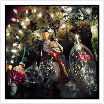
  beer bottle lights ~ Wilmington, NY - in the Adirondack PARKclick to embiggen


