counter customizable free hit
About This Website

This blog is intended to showcase my pictures or those of other photographers who have moved beyond the pretty picture and for whom photography is more than entertainment - photography that aims at being true, not at being beautiful because what is true is most often beautiful..

>>>> Comments, commentary and lively discussions, re: my writings or any topic germane to the medium and its apparatus, are vigorously encouraged.

Search this site
Recent Topics
Journal Categories
Archives by Month
Subscribe
listed

Photography Directory by PhotoLinks

Powered by Squarespace
Login

BODIES OF WORK ~ PICTURE GALLERIES

  • my new GALLERIES WEBSITE
    ADK PLACES TO SIT / LIFE WITHOUT THE APA / RAIN / THE FORKS / EARLY WORK / TANGLES

BODIES OF WORK ~ BOOK LINKS

In Situ ~ la, la, how the life goes onLife without the APADoorsKitchen SinkRain2014 • Year in ReviewPlace To SitART ~ conveys / transports / reflectsDecay & DisgustSingle WomenPicture WindowsTangles ~ fields of visual energy (10 picture preview) • The Light + BW mini-galleryKitchen Life (gallery) • The Forks ~ there's no place like home (gallery)


Entries by gravitas et nugalis (2919)

Tuesday
Jan062015

diptych # 119 ~ narrative and concept, pt. 1 - is a picture worth a thousand words?

1044757-25810394-thumbnail.jpg
stuff on the dining room table ~ Au Sable Forks, NY - in the Adirondack PARK • click to embiggen
On the recent entry, 2014 selects ~ potpourri o' pictures, Eric Fredine wrote: "I’d love to hear your thoughts on the role of concept and narrative in a portfolio. Its a self-serving request because I’ve been thinking about it without much satisfaction. (But at least the thinking seems to have some value even in the absence of clear conclusions.).

my reply: I've started writing my reply 3 times. Each time resulted in the deleting and rebooting of my words and thoughts. Or, to quote Eric, "I’ve been thinking (and writing) about it without much satisfaction." In any event, I think this reboot will be on the right track .....

Eric raised the idea of concept and narrative within the stricture of a portfolio. A portfolio is, in this context, a collection of pictures which is normally organized around a specific theme or style (aka: concept). That is, a related / cohesive body of work which illustrates - the picture and referent(s) themselves - and illuminates - implied narrative / meaning - the central idea of the picture maker's intent.

Narrative in a picture or pictures can best be understand when thinking of pictures created in the photo-story / photo-journaism M.O. See W. Eugene Smith's landmark groundbreaking photo essay, Country Doctor as a prime example. Or, Walker Evans' pictures in the book Let Us Now Praise Famous Men. Creating a narrative can be accomplished with just a single picture as well. See Nick Ut's Napalm Girl.

In the aforementioned cases, narrative can best be described as a form of story telling albeit told in pictures rather than words. Various interpretations of those narratives / stories, made by various viewers, can be had for a number of reasons. Consider Susan Sontag's observation:

Photographs, which cannot themselves explain anything, are inexhaustible invitations to deduction, speculation, and fantasy... The very muteness of what is, hypothetically, comprehensible in photographs is what constitutes their attraction and provocativeness.

Unless a picture maker states / writes about his/her intended narrative, the pictures will be open to a wide range of "deduction, speculation, and fantasy". And even then, viewers are apt to ignore the picture maker's statement and create one of their own making. IMO, that fact is one of the medium's prime attraction for me - the best pictures - mine and those made by others - are those which avoid a propagandistic approach and which embrace the medium's ambiguity, meaning / understanding / narrative wise.

That is to write, pictures which, although they might hint at a narrative / meaning, leave plenty of room in the viewer's mind to form their own conclusions. Let the viewer decide because he/she brings to their viewing, as Sir Ansel suggested, all of their accumulated experience of "all the books we have read, the movies we have seen, the music we have heard, the people we have loved". ASIDE: heaven help those who read only pop drivel (if they read at all), listen to pop music, and have been unlucky in love.

I would also consider the notion of narrative in a picture or pictures to not be limited to literal story telling. IMO, a narrative can be thoughts, ideas and emotions which spring to a viewer's mind when instigated by the viewing of a picture. That is, thoughts, ideas and emotions which fall beyond / outside of the picture maker's intended narrative, aka: Sontag's "fantasy" notion.

All of that written, it seems obvious to me that the narrative to be found in a picture or a portfolio collection of pictures flows directly from a picture maker's picturing concept. I will deal with that idea in my next entry inasmuch as this entry has probably stretched the attention span of most readers*.

*this statement is not meant as an insult to my readers. It is merely a statement of online reading propensities.

Thursday
Jan012015

civilized ku # 2859 ~ 'tis the season - New Year's Eve

1044757-25815047-thumbnail.jpg
New Year's Eve Happy Hour Party ~ 20 Main / Au Sable Forks, NY - in the Adirondack PARK • click to embiggen
December 31, 2014. Last picture of the year - a hand-stitched 5-frame panoramic.

Tuesday
Dec302014

civilized ku # 2855 / diptych # 118 ~ 'tis the season - good eats

1044757-25810004-thumbnail.jpg
red door ~ Lake Placid Lodge / Lake Placid, NY - in the Adirondack PARK • click to embiggen
1044757-25810002-thumbnail.jpg
scallop appetizer / Canadian venison ~ Lake Placid Lodge / Lake Placid, NY - in the Adirondack PARK • click to embiggen
Xmas dinner at the Lake Placid Lodge.

Sunday
Dec282014

civilized ku # 2851-54 ~ 'tis the season - life at 60mm

1044757-25805976-thumbnail.jpg
Hugo (in red) taking a faceoff ~ Plattsburgh, NY • click to embiggen
1044757-25805978-thumbnail.jpg
Bonhomme* ~ Au Sable Forks, NY - in the Adirondack PARK • click to embiggen
1044757-25805981-thumbnail.jpg
red pepper ~ Au Sable Forks, NY - in the Adirondack PARK • click to embiggen
1044757-25805983-thumbnail.jpg
Santa / Pride of the Adirondacks ~ Plattsburgh, NY • click to embiggen
When pressed by Santa to make a choice between a new lens or a new camera, I decided I need a new camera like I need the proverbial hole-in-the-head. Hence, Santa sent a 60mm f2.8 lens by FedX for late Xmas Eve delivery and I didn't need a tube of super-sealant to plug a hole in my head.

The primary intended use for the lens is to fill a "need" for a moderate tele with which I will make pictures of Hugo playing hockey (see hockey picture in this entry). And, after a brief hockey picture making go at it, it looks like the lens with fill that bill quite well.

That written, I have also made a few non-hockey pictures (see the 3 non-hockey pictures - all made @ f2.8 - in this entry) and I must write that I believe the lens will get more use than just making hockey pictures. At this point I can't speculate on what that usage will be but I can write that the lens produces pictures with a very nice look and feel. And, as I discovered, it is incredibly sharp, no ... make that exceptionally sharp, even wide open.

I am not a sharpness freak by any stretch, but from the very first file processing, I was struck by the sharpness factor. This just might be the sharpest lens in my µ4/3 kit, matching that of my 4/3 "pro" lenses which I use on my µ4/3 cameras with an adapter. Very impressive indeed. FYI, I am not alone, re: sharpness. After reading number of reviews (after delivery, not before) in an effort to confirm my opinion, the consensus, re: exceptional sharpness, is nearly unanimous.

Sharpness aside, the lens delivers a very nice color rendition and a very decent bokeh. AF is fast enough to make hockey pictures and the lens is part of the Sigma "Art" line of lenses - DN / A - so what's not to like? Now I can be certain that I am making art ....

All of that written, the lens has another exceptional factor, i.e. the price. This is the first non-Zuiko lens in my kit - it's a Sigma lens. At $200.00USD (give or take a ten spot), complete with lens hood and padded carrying case, it comes in at well less that half of the Zuiko 60mm f2/8 macro - $499.00USD + $45.00USD for a lens hood - Olympus doesn't offer a lens case.

For the µ4/3 crowd out there (there is Sony NEX variant as well), this lens is a no-brainer acquisition.

PS I don't often write about gear but every once in a while I come across something that is well worth a mention.

* Even though he's kinda scary in a horror movie kinda way, Bonhomme (bonhomie) is the ambassador of the Quebec City Winter Carnival, where we first encountered him. The word comes from French - frank and simple good-heartedness; a good-natured manner; friendliness; geniality.

At the Quebec Winter Carnival, Bonhomme's head is used as a cap on hollow plastic walking canes filled with Caribou - a sweet Québécois alcoholic beverage composed of red wine, hard liquor, usually whisky, and maple syrup or sugar .... which goes a long way in explaining the good-natured manner; friendliness; geniality (as well as the drunkenness) of Winter Carnival attendees.

Wednesday
Dec242014

diptych # 117 ~ 'tis the season

1044757-25800869-thumbnail.jpg
Black Brook ~ Au Sable Forks, NY - in the Adirondack PARK • click to embiggen

1044757-25800806-thumbnail.jpg
exhibits / St Joseph Oratory Museum ~ Montreal, Quebec, CA • click to embiggen

Monday
Dec222014

2014 selects ~ potpourri o' pictures

1044757-25794591-thumbnail.jpg
• click to embiggen
1044757-25795310-thumbnail.jpg
• click to embiggen
1044757-25878013-thumbnail.jpg
• click to embiggen
1044757-25878015-thumbnail.jpg
• click to embiggen
1044757-24256541-thumbnail.jpg
• click to embiggen
1044757-24256545-thumbnail.jpg
• click to embiggen
1044757-24256575-thumbnail.jpg
• click to embiggen
1044757-24256577-thumbnail.jpg
• click to embiggen
1044757-24256589-thumbnail.jpg
• click to embiggen
1044757-24256594-thumbnail.jpg
• click to embiggen
1044757-24256608-thumbnail.jpg
• click to embiggen
1044757-24256610-thumbnail.jpg
• click to embiggen
1044757-24256625-thumbnail.jpg
• click to embiggen
1044757-25795385-thumbnail.jpg
• click to embiggen
1044757-25795399-thumbnail.jpg
• click to embiggen
1044757-25795404-thumbnail.jpg
• click to embiggen
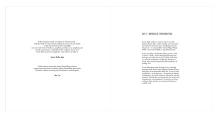
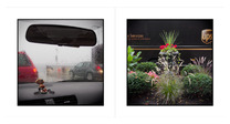
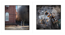
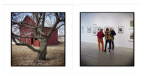
I have completed my 2014 Year-In-Review picture selection endeavor. Some FYIs, re: the process:

1. The arbitrary limit of 20 pictures was changed to 30. No particular reason other than, when all was said and done, that number of pictures seemed to look and feel right.

2. The selection process was not as difficult nor as time consuming as I first thought. In my head there were a number of give-and-take / in or out "conversations" but, ultimately, my mind was not fried in the process.

3. When organizing the pictures for the book, the pictures were placed in no specific order other the fact that I was deliberately paying attention to making spreads that would not be made / viewed as having "matching" referents. Presenting random referents was the order of the day / point of the endeavor. FYI in an FYI - the pictures are presented as spreads in the order in which they appear in the book.

4. No outside-of-my-head opinions or comments were solicited or volunteered in the selection process. The choices were all mine and mine alone.

5. I'm very pleased with the results and would very much appreciate comments.

ASIDE: During the selection process, it occurred to me that I should, as time allows after the first of the year, start making year-in-review selections for previous years. I must admit that while that idea is very attractive, It is also very intimidating, time and effort wise. Only time will tell where that idea goes.

That written, as I was contemplating such a project, the notion that there should be an over-arching umbrella project title / name. After letting the idea bounce around inside my skull like a bunch of BBs careening around in a lotto drum, I came up with a idea for a name in the form of a logo:

It makes sense to me. In fact, I cannot think of a better phrase to describe my pictures / picture making activities. And, not mention all of the spinoff uses - logo hats / golf shirts / sweatshirts / cashmere sweaters, logo camera bags, logo fountain pens, logo coffee cups, etched logo cut crystal bourbon glasses .....

Friday
Dec192014

civilized ku # 2850 ~ Main Street

1044757-25786745-thumbnail.jpg
Main street ~ Au Sable Forks, NY - in the Adirondack PARK • click to embiggen

Tuesday
Dec162014

diptych # 116 ~ glue

1044757-25778698-thumbnail.jpg
2 trees ~ Canton, NY / Pittsburgh, PA • click to embiggen
From yesterday's entry, diptych # 115 .....

Featured Comment: Eric Fredine wrote (in part): "I'm ambivalent. It's an arbitrary timeframe and it often results in a hodge-podge of images with no strong unifying theme. On the other hand, I find the most useful way to differentiate between the truly worthy and the merely good is by looking at images in a collection.....

I agree with Eric's idea of looking at pictures in a collection. Not doing so does indeed produce a hodgepodge of images. However, IMO, even with such a collection, I have found that, in the case of my hodgepodge collection, there is a certain continuity, vision wise, in all of the pictures. That is, a continuity which mitigates the hodgepodge-ness.

That continuity was pointed out to me by several gallery directors upon the occasions of viewing my Bodies of Work ~ a sampler book - a book of pictures presented as collections of different bodies of work. The common comment was essentially that they all saw a very distinctive vision or picturing M.O. which was evident across all the various bodies of work. In effect, they believed that, presented with one picture from each body of work as a group they would be able to discern that the pictures were all made by the same picture maker.

ASIDE: IMO, I would venture to write that given a hodge-pod of images from Eric's work, I would notice the same thing - a continuity of vision, with very few exceptions, across all of his pictures. end of ASIDE

As an example (in my case), consider the pictures in my the LIGHT book. There certainly is a hodgepodge of referents but, to my eye and sensibilities, all of pictures are "unified" by my picturing M.O., AKA: vision.

All of which got me started on my best-pictures-of-the-year idea. My objective is to create a collection of pictures which will be presented in year-in-review book. Hopefully, that collection of very diverse referents will exhibit the same continuity of vision which, again to my eye and sensibilities, will glue the collection together as an all-of-a-piece collection.