2014 selects ~ potpourri o' pictures
 Monday, December 22, 2014 at 11:01AM
• click to embiggen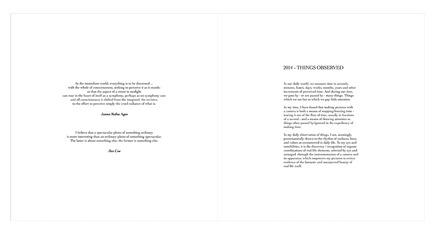
• click to embiggen
• click to embiggen
• click to embiggen
• click to embiggen
• click to embiggen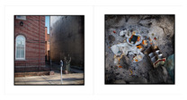
• click to embiggen
• click to embiggen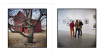
• click to embiggen
• click to embiggen
• click to embiggen
• click to embiggen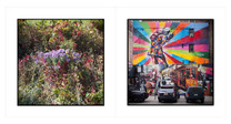
• click to embiggen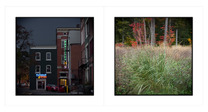
• click to embiggen
• click to embiggen
• click to embiggenI have completed my 2014 Year-In-Review picture selection endeavor. Some FYIs, re: the process:
1. The arbitrary limit of 20 pictures was changed to 30. No particular reason other than, when all was said and done, that number of pictures seemed to look and feel right.
2. The selection process was not as difficult nor as time consuming as I first thought. In my head there were a number of give-and-take / in or out "conversations" but, ultimately, my mind was not fried in the process.
3. When organizing the pictures for the book, the pictures were placed in no specific order other the fact that I was deliberately paying attention to making spreads that would not be made / viewed as having "matching" referents. Presenting random referents was the order of the day / point of the endeavor. FYI in an FYI - the pictures are presented as spreads in the order in which they appear in the book.
4. No outside-of-my-head opinions or comments were solicited or volunteered in the selection process. The choices were all mine and mine alone.
5. I'm very pleased with the results and would very much appreciate comments.
ASIDE: During the selection process, it occurred to me that I should, as time allows after the first of the year, start making year-in-review selections for previous years. I must admit that while that idea is very attractive, It is also very intimidating, time and effort wise. Only time will tell where that idea goes.
That written, as I was contemplating such a project, the notion that there should be an over-arching umbrella project title / name. After letting the idea bounce around inside my skull like a bunch of BBs careening around in a lotto drum, I came up with a idea for a name in the form of a logo:
It makes sense to me. In fact, I cannot think of a better phrase to describe my pictures / picture making activities. And, not mention all of the spinoff uses - logo hats / golf shirts / sweatshirts / cashmere sweaters, logo camera bags, logo fountain pens, logo coffee cups, etched logo cut crystal bourbon glasses .....

Reader Comments (5)
Your eye loves red. It appears in a majority.
I see echoes of form, texture and colour in the pairings suggesting some care in making them? For example there is one pairing with bushy hair left and bushy bush right. That pair has other echoing forms such as a sloping window frame left and an arched tree right.
Well done.
An excellent selection. It is interesting that on the surface the pairings seem at first unrelated and yet, after some moments spent with each, some commonalities seem to appear, mostly with forms, lines and colours. Perhaps I am only imagining them but that's ok. As a set, these images work exceptionally well though I am guessing that would be due to the wonderful consistency you bring to your images which to me, defines your unmistakable style.
I'm envious.
Well done.
Well, I tried to restrain myself in my initial comment hoping not to monopolize the conversation. But there's more to discuss.
First of all, it is a superb collection of images. I've returned to view it several times. It rewards subsequent viewings with new insights and delightful surprises. That's perhaps the truest test.
As expected, they are very cohesive. You have a distinct and readily recognizable way of seeing the world. It's amplified by your strict adherence to a square aspect ratio and consistent treatment. If I had to pick, I’d say I prefer the portfolios where you gaze upon a broader range of referents to those that are more constricted.
I’d love to hear your thoughts on the role of concept and narrative in a portfolio. Its a self-serving request because I’ve been thinking about it without much satisfaction. (But at least the thinking seems to have some value even in the absence of clear conclusions.)
georgfinn e3d3fd1842 https://www.qgsocial.space/rtictesilkde