Saturday
Apr162016
civilized ku # 3078 ~ the perfect refrigerator ...

hotel room refrigerator ~ Marlborough, Mass. • click to embiggen....everything one needs for a long youth hockey tournament weekend.
![]()


BODIES OF WORK ~ PICTURE GALLERIES
BODIES OF WORK ~ BOOK LINKS
In Situ ~ la, la, how the life goes on • Life without the APA • Doors • Kitchen Sink • Rain • 2014 • Year in Review • Place To Sit • ART ~ conveys / transports / reflects • Decay & Disgust • Single Women • Picture Windows • Tangles ~ fields of visual energy (10 picture preview) • The Light + BW mini-gallery • Kitchen Life (gallery) • The Forks ~ there's no place like home (gallery)
hotel room refrigerator ~ Marlborough, Mass. • click to embiggen....everything one needs for a long youth hockey tournament weekend.


While different image processing engines from different camera manufacturers do have their own unique color signature, the exaggerated color vibrancy / saturation seen in prints generated from digital output is rarely the result of a camera's processing engine (with the exception of in-camera generated jpegs). In virtually all cases, the cause of the problem can be found in how a image file is processed after the file is out of the camera and into the hands of the picture maker.
All RAW processing software and photo editing software - Photoshop, LR, and the like - is capable of producing clean well-balanced natural color much like that obtained using a traditional color negative film from KODAK (iMo, the gold standard of natural color). However, the # 1 tool for producing such results is also the # 1 tool for screwing things up...
... CURVES.
Rather than trying to create an online primer on the use of CURVES, let me just mention a few do's and don't's, re: color image file processing (if your goal is natural color):
1) never shoot jpegs, always shoot RAW.
2) use a RAW processor which allows for WB fine tuning - that is, after setting a good WB point, an ability to fine tune at least the red / green component of that WB setting (independent of using CURVES).
3) in a RAW processor or PS/LR, never, ever, use the RGB curve to adjust contrast. Adjust contrast in the LAB colorspace L (lightness) channel to avoid the inevitable color saturation which results from bending the RGB curve.
4) never use sliders to adjust contrast, brightness or color. Use CURVES.
5) use a RAW processing program which allows adjustments to be made in LAB colorspace.
6) proper use of CURVES in individual color channels (RGB and LAB) will minimize the use of H&S sliders for anything other than very minor tweaks (a good thing). I use the LAB a channel (red/green) and b channel (yellow/blue) for my primary hue and saturation adjustments.
7) learn at least some basics about LAB colorspace.
8) avoid over-sharpening like the plague.
9) come to grips with the idea that not every picture requires a full tonal range (10-250ish).
These basic do's and don't's are not the end-all and be-all of natural color P's & Q's. However, it's pretty difficult to obtain clean well-balnaced natural color without nothing and understanding them.
FYI, off to Marlborbough, Massachusetts. Will post tomorrow.


Much of my thinking has been on topics, photography wise, instigated by 2 primary factors - 1) "...Many contemporary photographers lament the “lifelessness” of digital images. We look at the picture, admire its vibrant colors and sharp lines, and still can’t help but feel nostalgic for the photographs of the old, pre-digital age." (Pavel Kosenko, author, LIFELIKE:A Book on Color), and 2) my recent acquisition (in NYC) of the book, SAUL LEITER: Early Color. And, to my way of thinking, items 1 and 2 are very closely related inasmuch as one is nostalgic for pre-digital age color and the other is a tour de force of pre-digital age color.
Pavel Kosenko's nostalgic lament is somewhat understandable to me inasmuch as I still believe that some of the pre-digital C prints I made were indeed beautiful, color space / tonal wise. That standard / benchmark of representational color and tonal value is still the one I aim to replicate in today's digital era. In doing so, I am very much de-digitalizing my digital picture files and have been doing so since my early digital picture making days.
My issue with the current standard / benchmark (for so many) of tack sharp, noise (aka grain) free and somewhat over-vibrant color is, to my eye and sensibilities, rather plastic or not lifelike as in the sense of not real or sincere. While many who ascribe to that picturing M.O. would state that they are trying to make "realistic" pictures, in fact (again, to my eye and sensibilities) they are making pictures which appear to be hyperreal as in the sense of something fake and artificial which comes to be more definitive of the real than reality itself.
You know, like the Nexus 6 replicants manufactured by the Tyrell Corporation which were made to be more human than human.
Inasmuch as Kosenko seems to think that replicating the look of analog film is the answer to introducing "life" to color pictures - he advocates for a RAW developer that is at its heart an effect app-like program with many presets for various types of analog films - I would disagree with his rational / nostalgic longings for "photographs of the pre-digital age".
Are pre-digital photographs more real (or less real) than digital era photographs? I think not. Are they more pleasant to the eye than the current crop digital picturing 'perfection'? iMo, unquestionably so. They are, to my eye and sensibilities, 'softer' and more gentle to behold.
Perhaps that is what I am experimenting with adding 'grain' (monochromatic digital noise) to my pictures - like those in this entry's diptych.
Or, is it both?

mirrors ~ Manhattan, NY • click to embiggen
 beer bottle lights ~ Wilmington, NY - in the Adirondack PARKclick to embiggen
For some reason, when I click on link (using Safari) on my desktop computer, I get a Norton warning - "Malicious Web Site Blocked". Then, when I click on the "I want to view this Web site anyway", it takes directly to the linked image in the popup window. This does not happen when I use Safari on my laptop - clicking on the link goes directly to the popup window. This also does not happen when I use Firefox on my desktop computer.
In any event, I await input from any of you who can not see the popup window when you click on the click to embiggen link. Please let me know if you have a problem. If this work around works for everyone, I will continue to post using it.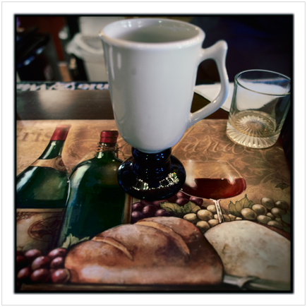 place mat ~ Wilmington, NY - in the Adirondack PARK
The problem on Squarespace started on Friday and has yet to be fixed although according to SS support, "[T]he whole image processing part of our platform is being actively looked at. We're hoping for a fix as soon as possible, and our engineers are currently working on it." They're hoping. I'm hoping. When a fix will be had, who knows.
That written, back to matters color processing wise - there have been a couple entries on TOP regarding color - Color Calibration and Color Photoshopping (on which I had a featured comment). And, on another TOP entry, mention was made of book, LIFELIKE: A Book on Color in Digital Photography in which the author attempts to address the "increasing lack of satisfaction with digital color" with techniques which, in a sense, replicate pre-digital film-like color and tonality.
I purchased the book (e-book for MAC platform only) out of curiosity and my return on investment was virtually nonexistent. While his thoughts on color are good and somewhat in line with my own, the author spends way to much digital ink on how past masters in the realm of painting handled color. While a reader might learn something about color theory and its application in painting, I fail to see its relevance to making pictures in the medium of photography.
In addition, his method for obtaining pre-digital color and tonality (film-like) depends on the use of a RAW converter - Raw Photo Processor (RPP) (free software, albeit for the MAC platform only) - which has a rather clunky non-intuitve interface and requires a pretty comprehensive re-think of the RAW conversion process.
I spent a fair amount of time using RPP on images I had previously processed using my standard RAW conversion software - Iridient Developer, a converter which is noted for its natural film-like output - and, quite frankly, it did not produce any results that I couldn't achieve using the ID software. But then again ...
... the results I achieve from ID software are obtained by using my 40+ years of technical color experience. Experience which is put to use in the cause of producing clean, well-balanced natural yet rich (non-garish, non-over saturated) color in my pictures.
None of the above should be understood or construed as a reason not to purchase the book or download RPP and give a try. I am certain that both could be of value to anyone who is interested in exploring color options that are much more life-like than that which is spit out by the 'canned' defaults in LR / CR and other such RAW converters. Post a Comment