counter customizable free hit
About This Website

This blog is intended to showcase my pictures or those of other photographers who have moved beyond the pretty picture and for whom photography is more than entertainment - photography that aims at being true, not at being beautiful because what is true is most often beautiful..

>>>> Comments, commentary and lively discussions, re: my writings or any topic germane to the medium and its apparatus, are vigorously encouraged.

Search this site
Recent Topics
Journal Categories
Archives by Month
Subscribe
listed

Photography Directory by PhotoLinks

Powered by Squarespace
Login

BODIES OF WORK ~ PICTURE GALLERIES

  • my new GALLERIES WEBSITE
    ADK PLACES TO SIT / LIFE WITHOUT THE APA / RAIN / THE FORKS / EARLY WORK / TANGLES

BODIES OF WORK ~ BOOK LINKS

In Situ ~ la, la, how the life goes onLife without the APADoorsKitchen SinkRain2014 • Year in ReviewPlace To SitART ~ conveys / transports / reflectsDecay & DisgustSingle WomenPicture WindowsTangles ~ fields of visual energy (10 picture preview) • The Light + BW mini-galleryKitchen Life (gallery) • The Forks ~ there's no place like home (gallery)


Entries in man and nature (234)

Tuesday
Aug052008

man & nature # 24 ~ same as it ever was

Toll bridgeclick to embiggenMy normal Jersey Shore thing is to simply avoid the oppressive heat and humidity. This entails staying inside in air conditioning and playing golf from a golf cart - 2 things that are not my favorite activities. Playing golf from a golf cart while sweating like you're in a sauna, ranks as one of my absolute least favorite things to do.

Going to the beach is not much fun for me since there are approximately 2 billion people on Stone Harbor beach during the day. Before 7AM or after 7PM the beach is virtually deserted, relatively cool, and, consequently, a refreshing place to be. But, other than the beach, unless you're into shopping for junk or designer stuff at the barrier island's 3×2 block "hub"/main street, there just ain't much to do in Stone Harbor.

I even stopped going on the annual sweat-fest for a few years. CousinsclickBut then Hugo came along and he developed an abiding relationship with his cousins (inlaw) from the wife's family, including his girlfriend, Sophie - hey, they could get married since they're not blood kin. And, once a year the entire clan is at The Shore, so I'm back, albeit in an abbreviated form of 3-4 days.

Last year I decided to start picturing The Shore and, after a fledgling effort, I came away with some good stuff. That experience and this year's Meyerowitz "coincidence" provided the impetus to approach it a bit more seriously this year.

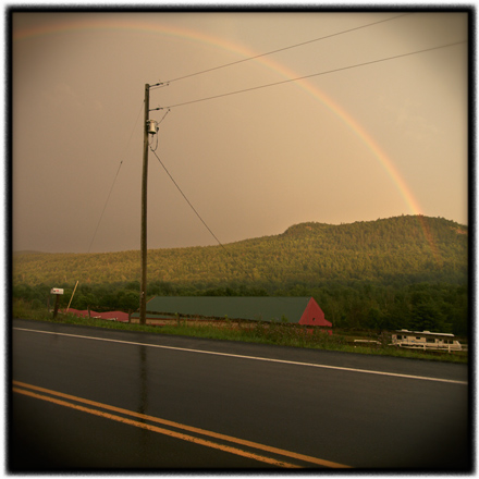
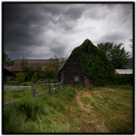
As coincidence would have it, this year The Jersey Shore put on quite a good light show. It gave me fog and mist, bright searing sunlight, some "classic" late day / evening shore light - a kind of soft hazy light, and one blazing sunset. It could not have been better, photography-wise. I felt lucky.

Relative to last year's fledgling effort and my intention to add those results to this year's results, Don asked: ... even though the images are a year apart, do you see a difference as far as your "making" of the images?

The short answer is, "No." Not at all. My modus operandi for picturing hasn't really changed in any significant way since ... well ... since I started getting serious about making picture that were more than entertainment, which would have been around 1980. Other than the obvious difference of format, square vs. rectangle, and my now standard vignette, my approach to and the results of my picturing hasn't changed much at all.

Check out some of my 8×10 view camera work from that time. IMO, the trademark MH/Landscapist plain seeing is as evident then as it is now. And, notice the black film edges, the ones that I mimic in my current work.

I think it would be fair to say that either I have found my groove or that I am stuck in a rut, depending upon your point of view.

In any event, getting back to yesterday's dilema, I have been exploring photo gallery site options and came across one that gives a free, full-features, 10 day trail. So, I have given it a test spin and posted 32 of my Shore Light pictures.

You can see it HERE. Please check it out and let me know what you think about it. More about the site itself than the pictures - things like the look, feel, and functionality of the site. Although, one of the functions of the site is the ability to leave comments on the individual pictures, so feel free to have a say.

FYI, once you click on "Shore Light" in the "Gallery" drop down menu, a bunch of pictures appear. Click on the first one, or any one for that matter, and it launches into a viewing window with all the thumbnails on the right side.

Monday
Aug042008

man & nature # 23 ~ a bit of a dilema

Jersey Shore arborclick to embiggenMy picturing at the Jersey Shore was an unmitigated success. While the ultimate test of that lies with those who view the pictures, I am very pleased with the results.

As I mention in the previous entry, I have nearly 70 "keepers" in the body of work which is tentatively titled Shore Light. I say "tentatively" because that moniker may be a little bit too close for comfort, re: Joel Meyerowitz's Cape Light. Although, it must be said that my pictures and his bear more than a passing kinship.

I am in no way trying to imitate Meyerowitz's Cape Light pictures. That said, it nearly impossible to visit and picture an ocean-side location and not be aware of the quality of the light and all of its variations. Meyerowitz used the phrase inside the light as part of the title of his Tuscany book and it is a very appropriate discription of the feeling one gets in places where the light has an unusual or very distinct quality. So, it should come as no surprise that the varying and distinct quality of shore light is, as with the Cape Light pictures, an integral part of my Shore Light pictures.

Like Meyerowitz, and as I have been practicing my entire picture making life, my intention with these pictures is, on the surface of things, an attempt to picture the place as it is. But in that sense, our pictures are different in as much as Meyerowitz captured the Cape at a time when it was still "authentic", relatively free of the ravages of modern wretched-excess development. I, on the other hand, have captured the Jersey Shore in the full-fledged throes of conspicuous consumption development - there is precious little "authenticity" left in Stone Harbor.

Nevertheless, our pictures are similar in that, as Meyerowitz has stated:

... it's always been to share the experience, as if I stood someplace and was stopped with a sense of wonder ... that's pure inspiration ... you're taking it all in ... It's like saying here, stand where I stood. I'm not going to tell you what to see. Just stand here and look at this.

Beyond the surface of things is something else. Again, as Meyerowitz has stated:

And if there's some passage to the viewer of the wonder of the unexpected moment, then that is making art or photography. Your sense of reality has been changed in that split second, which has now been crystallized into the moment of consciousness, and then that is captured somehow, and now you have a chance to look at it and trip out.

In any event, here's my dilema - As mentioned, I have more than 70 images (processed to date) from my recent picturing and another 20+ from last year's trip, which I believe, when viewed as a body of work, really does captures a very real sense of the place that is Stone Harbor, NJ. But, if I dole them out one a day for 90+ days, I will probably lose the room. It's vitally important that they be viewed as a body of work, not a series of one hit wonders.

So, the only solution I can think of is an online gallery / site devoted to just the Shore Light series. A "pure' gallery of just pictures with an opening Artist Statement. That and a book. Give me a little time and I'll have both for your viewing pleasure.

Sunday
Aug032008

man & nature # 22 ~ like playing golf in Scotland without the airfare

Twisted Dunes # 16click to embiggenI'm back and have spent the better part of the day in the "darkroom" wherein I have "developed" 60 images from over 250 that I created on the Jersey Shore.

That number does not include the above images of Twisted Dunes GC - # 16, Egg Harbor Township, NJ. The 16th hole at Twisted Dunes is a 165 yard par 3. It is rated as the 18th handicap hole on the course meaning that, in golf parlance, it is the easiest hole on the course.

If one of the gods of golf sat me down and told me I could only play 1 golf course for the rest of my life, Twisted Dunes just might be the one. Typical green and fairwayclick There is not a tree on the course which is built in an old quarry. Instead of tree-lined fairways there are only dune-lined ones that are covered with deep wild grasses. The picture on the left gives you an good idea of the size of the dunes.

I love this course (I've played it 3 times) because it has such a lay-of-the-land feel to it - very Scottish / Irish seaside links style. Typical tee shotclickThe illusion here (unlike the real deal in Scotland and Ireland) is that the tees, fairways, and greens are placed where nature let them be placed. There is a sense that god, not a golf architect, decided where the those things would be.

The course is very near the ocean so wind does come into play, some days more than others, and like its Scottish / Irish brethren, many a tee shot is semi-blind - you see the fairway but not where a well-struck drive will end up. A number of fairways rise over a hillock and out of sight, most often with a slight dogleg beyond your line of sight. A good yardage book is a necessity.

In any event, the next entry will begin my Shore Light series. There will be a book.

FYI, I carded an 81.

Monday
Jul282008

man & nature # 21 ~ scratch my back with a hacksaw

The Grand Prix Motor Lodgeclick to embiggenOver the entire course of my life, especially so in my adult years, I have experienced quite a number of "coincidences". You know, you think something then something like it happens. You think about someone you haven't seen in a while and, shortly thereafter, the phone rings.

These type of things happen to me in bunches - 2, 3, sometimes 4 "coincidences" in a row over a couple of days. Then, nothing for weeks or even months. And, no, this is not anything that I can control. I don't think /dream winning lotto numbers, trifectas, etc. I can't wish something to happen and make it so. They are just "coincidences", although I am convinced that that word is no longer the right word to describe the experiences.

That said, Yesterday's "coincidence" left me not knowing whether to cry or wind my watch. I was ready to buy Sam a drink and get his dog one too. I felt like I had been cow-kicked.

Why is that, you might ask? Well, consider this - after making yesterday's entry, more on "plain seeing", I left the house to run some errands in Plattsburg - have a 24×36 print made, buy some Summer reading, and then play a round of golf. On the drive to Plattsburg, I was thinking about today's entry which was going to be in response to Stephen Connor's comment on the topic of plain seeing:

Um, sadly, "plain seeing" may draw attention to the referent, not to the artist, but it makes crap art. Turn with me now to plate 15, from "Cape Light" by Joel Meyerowitz. It's a swimming pool, some chairs, a beach umbrella, and the horizon. Pretty darn plain, if you ask me. Anybody REALLY think the average photographer would take a photograph as beautiful as this of this scene? Anybody think the hand of the artist isn't visible? Anybody really think "the referent" is all that matters here?

I had a link ready to go to some of Meyerowitz's work so that you could see Plate # 15 and other pictures that I felt would support my position re: Meyerowitz's photography. I also had the above picture selected to accompany the entry. It was going to be something like this:

I think the photography of Joel Meyerowitz is an excellent example of plain seeing. His pictures are very often about stuff that appears to be nothing important. To the untrained eye, they also seem to be rather randomly composed. To my eye and sensibilities, they appear to have been made rather effortlessly and they make me feel like I am seeing what he saw in a very plain way.

Now, I know that Meyerowitz uses an 8×10 view camera so also know that his pictures are not made "effortlessly" and, in all probably, that they are not randomly composed. I also know that these pictures evidence more than a little relationship to his NYC street photography approach to picturing.

So, Stephen, in this case, I am acutely aware of the hand of the artist, and no, I don't think that the average photographer "would take a photograph as beautiful as this of this scene". Nor do I think that the referent is the only thing that matters in his pictures. However, none of that says that the pictures are not plain seeing the the sense that I tried to make plain in yesterday's entry.

But, let the coincidences begin:

1) When I made the Grand Prix picture, a day or so before Stephen's Meyerowitz reference, I thought, as I was making it how Meyerowitz-like - the light, the subject - it was (more on that latter, if anyone wants to know). Little did I know that just a short while latter, it would be a perfect picture to accompany an entry about Joel Meyerowitz.

2) Yesterday afternoon, as I perused the photo magazine section for Summer reading, I found the current issue of Focus and, low and behold, it contained an interview with Joel Meyerowitz. I flipped to the interview and the first thing I read was this:

It's important to be able to read your entire body of work for the discoveries of who you were at that moment in your consciousness. Was I as conscious then as I am now? No, I'm only as conscious as I am now because of then, because the past allowed me to explore things in a very narrow focused way.

note; the italic emphasis are his, the bold emphasis are mine.

For those of you who didn't read yesterday's entry, compare that to this from that entry - written before I found the magazine - to understand the "coincidence" and why the hairs on the back of my neck were beginning to tingle:

I also that seeing clearly is an after-the-fact discovery for the photographer. For virtually every photographer who is making a body meaningful pictures, there was a process of discovery, of learning, about their chosen referent. The work we see is the work that results from an extended examination by the photographer of a referent that they now know something about ...

3) Ok. I have finished my errands and it's off to the golf course where, after 15 holes of playing alone, a nother solo golfer comes up behind me and asks to finish out the round with me. So we do it together with a bit of casual chatting. He's from Boston and in the area on a 5 month job working on the installation of some giant wind turbine farms (he seemed like he was from the managerial class, not the labor class). He and few other workers are living some temporary housing with which they were not very happy. Looking for different housing was what brought him to Plattsburg and this gold course.

Fast-forward. We wrap it up and go to our cars, pack up, and head out, he before me. A short distance on down the road, I come up behind him and we continue on our way until he arrives at his temporary housing - none other than the Grand Prix Motor Lodge.

That was it. Way to much "coincidence" for me. You could have scratched my back with a hacksaw. I didn't know whether to cry or wind my watch. I felt like I had been cow-kicked or beaten like a rented mule. I definitely needed a drink and I was going to buy one for Sam and his dog too.

PS - I would highly recommend buying the current issue of Focus if for no other reason than the Meyerowtz interview. It is very interesting and has lots to offer re: growing as an artist.

Saturday
Jul262008

man & nature # 20 ~ the big picture

The whole pictureclick to embiggenThis is the entire scene that I encountered on Thursday from which I pictured yesterday's entry.

Yesterday's picture was not the only image I made of the scene. There are 2 more, one of which is quite "idyllic". I'll get around to posting it soon although, I must state, that it is my least favorite of the group. Even though it is plain seeing, it still leaves me a bit uncomfortable with its stunning beauty - it has the look and feel of a Hudson River School painting.

Friday
Jul252008

man & nature # 19 ~ imagine that

Rainbow in light rainclick to embiggenOnce again, the ever popular question, "How can I make better pictures?", has come to the forefront on a couple blogs / websites. Most notably so on Craig Tanner's Radiant Vista whereon he has a podcast, Finding the Heart of Your Work. The podcast is a somewhat delayed response to Joe Reifer's Going deeper may require more abstract excursions entry of May 22nd.

These two ruminations are seemingly related to part of the standard online forum mission statements which claim to answer the questions posited by means of having your picture(s) critiqued on their forums. Unfortunately, the critiques thereon are almost exclusively biased towards technique and gear which is of very little help (if any) in answering the question posited by Joe Reifer regarding how to make more meaningful pictures.

What most on these critique forums fail to realize is that there really isn't any easily canned prescribable dictumm for making meaningful pictures. The fact is, it is totally dependent upon the type of person you are. Things like, but not limited to; are you curious? are you aware? are you empathetic? are you interested in figuring things out? are you capable of seeing things anew?

Instead of thinking about gear and technique, think about this:

The greatest thing a human soul ever does in this world is to SEE something, and tell what it SAW in a plain way... To see clearly is poetry, prophecy, and religion, all in one. - John Ruskin

I agree whole heartedly with this idea and, IMO, the key to making meaningful pictures is expressed in the phrase, "tell what it SAW in a plain way". Too many people with cameras are too wrapped up in trying to make pictures that look like ... well ... pictures. By that I mean, they are trying to make pictures that look like what they have been told - either by online critique-ers, how-to books, or even well intended gurus - are good pictures. If they succeed in accomplishing that goal all they make are an endless stream of look-a-like homages to what they have seen before.

IMO, a good pictures doesn't look like a picture. It looks like what I see or, more accurately, when viewing the work of others, what they saw. It simply looks like seeing. The more closely related to plain seeing, the better. As many have opined, the best Art most often has the appearance of being effortlessly made.

Plain seeing draws attention only to the visual referent (the subject), not the photographer and by so doing, plain seeing helps the viewer establish an easier connection to the connoted (the implied, or, if you will, the meaning). To wit, the illustration does not get in the way of illumination.

And, consider this, with its intrinsic characteristic as an inimitable cohort with the real, no other visual medium can see as plainly as the medium of photography. Imagine that. What a coincidence.

Wednesday
Jul232008

man & nature # 18 ~ simple economics

Barn and storm cloudsclick to embiggenOver the past year or so there have been a fair amount of ongoing online discussions about print pricing - prices are too high / absurd, prices are too low / absurd, make only 6 prints, make unlimited prints, etc. is the general gist of it. Maybe for most, the conversation is rather moot in as much as they won't be selling prints at any price or in any size edition.

Since I am anticipating a gallery show or two (hopefully), I have been thinking about print pricing. Some may recall from a previous post that I tentatively plan to sell my decay & disgust prints - 30×30 inch image on 48×48 inch paper - for in the neighborhood of $1,800. Now, to some, this might sound like an absurdly high price but consider the economics of the deal.

The print itself will cost approx. $250 to make (from a very skilled print maker) so, doing the math, we are now talking about $1,550. Still sound like a lot? From that number, a gallery will take a 40-50% cut leaving (at 50%) $775 for me. Still sound like a lot? I will typically incur about $50-$70 of in-house work print costs getting the master file ready to send to the printer. And, realistically, add to that another $100 of general amortized overhead expense.

At this point, I am left with approx. $600. Now, think about that - if my desire is to be a self-supported artist, by which I mean to be able to fully support myself and my art, I would have to sell at the very least 100 prints a year. Even with very good gallery representation, IMO and experience, that would be a tough nut to crack.

It's no wonder then that those photographers who have at least a bit of a high-end reputation price their work in the $5,000-$8.000 range, which, if you don't do the math, sounds absurd, right? But, if you do the math, it helps explain why so many artist photographers are also working some kind of day job.

All of that said, my pricing objective is going to be similar to that of 20×200 - their math goes like this; 3 different sized numbered print editions (small @ $20×200, medium @ $200×20 , large @ $1,000×2. 3 editions = $10,000.

The concept is proving to be very successful. Last week's photograph has nearly sold out - there is only 1 large print left unsold. That's $9,000 of print sales in 1 week. That, my friends, is amazing. And, what I like most about the concept is that, @ $20 for a small-edition print, virtually anyone an be a "collector".

I don't know what the math of 20×200 is - the artist / gallery split, but, judging by the apparent success of the concept, they are on to something here. What the results indicate is that there is a demand for a given photograph at the low end, the middle, and the high-end (albeit, in this case, the low high end) of the market thus rendering the conversation about how to price one's work - low cost / high print numbers vs high cost / low print numbers - relatively irrelevant.

Do both.

Tuesday
Jul222008

man & nature # 17 ~ tower of babble

4 porches in the rainclick to embiggenYesterday, my ire, which was directed at SquareSpace, stemmed from the fact that the upgrade caught me entirely by surprise. To be fair to SS, they had posted an announcement somewhere in what, to me, are the bowels of the Administration section of the blog software - a place that I visit rather infrequently. There really is no need for me to go there on any kind of regular basis.

Even if I had visited that section, found the upgrade notice, and click through to read it, what I would have found was a typical PR/sales piece about how great things are along with a long list of new and improved features - something that I may have glanced at but not really paid a lot of attention to. As far as I am concerned, The Landscapist is chugging along just fine, thank you, and I don't really have any plans to change anything at the moment so all of the swell new stuff just doesn't matter to me at all.

At the very bottom of the announcement was this little bit:

As always, clear your browser caches to ensure you receive the updated code. If you experience problems (and there will be some small problems!) — please write in immediately.

Of all of the info on the announcement, this bit is all I care about. One would think that this little bit would be the first thing on the announcement, in bold type, maybe screaming red in color. One would think that an email blast to every SS subscriber might be in order. One would think that, if a change is being made that will effect everyone, every means available would be used to be certain that everyone knew about.

To be certain, I am, and have been, happy with SS. They respond in good time and good fashion to support issues. I like their sense of design and utility in the templates that they offer. The ability to customize their templates is pretty easy for a non techno/code/geek person. All in all, to repeat, I am very happy with my experience with SS and would recommend them to my friends and neighbors.

That said, my ire regarding this issue is a more general one regarding the entire software industry. An industry that seems to think that the end users of their products have nothing more to do with their time a than to track and implement - "implement" is a sorry understatement for the amount of time and effort involved in many cases - an endless stream of upgrades, patches, fixes, etc.

Simply put, the software industry has us running non-stop like hamsters on a wheel. Have you ever owned anything in your life that requires / required the constant attention, maintenance and cost that software does? Think about it. Is there anything you own that owns you as much as software? And, like compliant protoplasmic slugs, aka, good little consumers, we just lie there and take it.